Mar 11, 2026
Journals
How to design a real estate experience center?
Most experience centers fail because they skip emotion. Learn the three-zone design that converts browsers into buyers.

Walk into most real estate experience centers and you'll see the same thing: reception desk, brochures, floor plans on an iPad, salesperson ready to recite square footage.
Client nods, asks questions, takes a brochure, leaves. Just like the last five properties.
That's not an experience center. That's an office with nicer furniture.
Real experience centers guide clients through three emotional zones. Most build only one (the boring middle) and wonder why nothing's selling.
Dividing it into 3 zones for explanation.
Zone 1: Attraction (30 seconds) - Make them stop analyzing
Zone 2: Information (5-10 minutes) - Help them understand
Zone 3: Immersion (15-30 minutes) - Make them feel it's theirs
Most centers spend 90% of space on Zone 2. That's the problem.
Zone 1: The Attraction
What most do: Reception desk, waiting chairs, logo on wall.
What works: One powerful visual moment visible from outside.
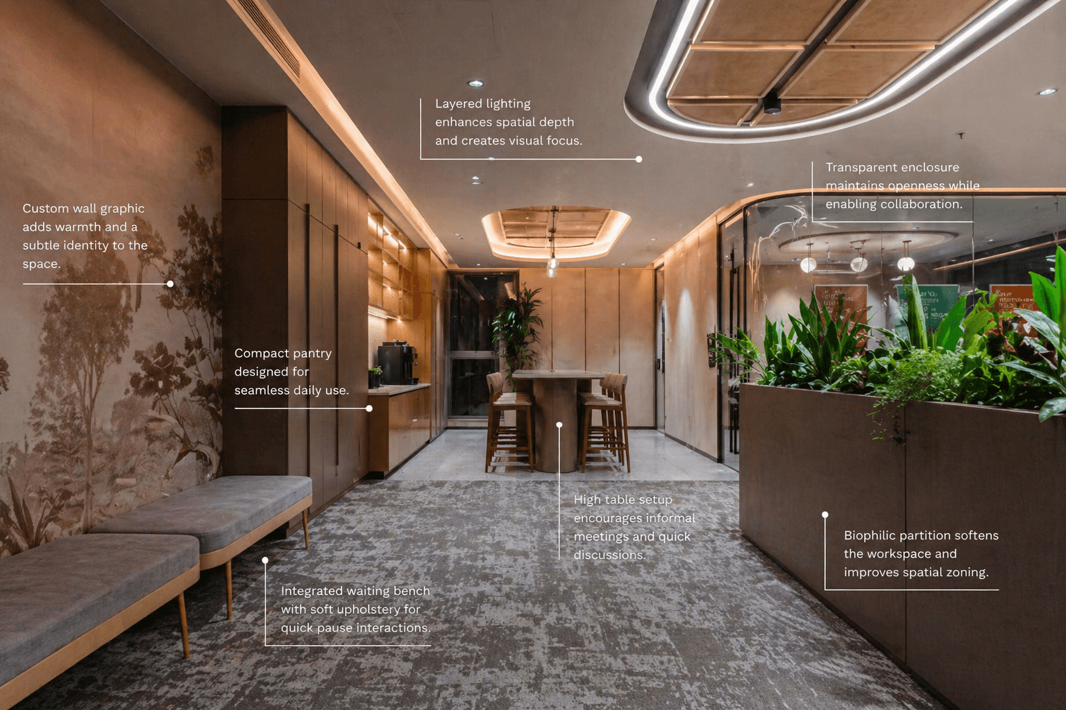
Create one memorable visual moment at the entrance, as the entrance kinda gives the visitor the what he or she may experience. A striking photograph, material installation, or media wall that captures your project's essence. This shifts visitors from analytical browsing to genuine curiosity.
Why it matters: You have 30 seconds before they mentally file this as "another property tour." Make them curious.
Zone 2: The Information
What most do: Hand them a brochure. Point to iPad. Recite amenities. Eyes glaze over.
What works: Let them explore at their own pace.
Let visitors explore on their terms. Interactive displays, physical models, and neighborhood context maps work better than brochures and sales pitches. Add comfortable seating for natural conversations, not formal desks.
Plus: Comfortable consultation seating (4-seater tables, not formal desks) for real conversations.
Don't trap them in 20-minute presentations. Let them skip to what interests them.
Zone 3: The Immersion
What works: Full-scale spaces where they physically experience life there.
Not the whole apartment. Just the moments that matter:
Living room + balcony (where they'll spend 80% of time)
Master bedroom with bathroom (morning routine)
Kitchen window area (heart of daily life)
Design full-scale spaces that bring life to the project: living room with balcony, master bedroom, kitchen area. Use actual finishes, real lighting for different times of day, and thoughtful lifestyle touches. When detailed well, visitors stop evaluating and start imagining their routines.
The Flow Matters
Bad: Reception → sales desk → maybe peek at model → leave
Good: Wow moment → explore freely → experience lifestyle → private discussion
To sum it up,
Zone 1 makes them interested.
Zone 2 makes them informed.
Zone 3 makes them emotionally attached.
Skip any zone? You're hoping price and location do the work.
Design all three? You transform browsers into buyers through experience, not pressure.
That's the difference between a sales office with nice furniture and an actual experience center.
or just send us a query and we would love to connect!